Tuesday, April 29, 2014

Holtwood House // Edibles Garden Progress


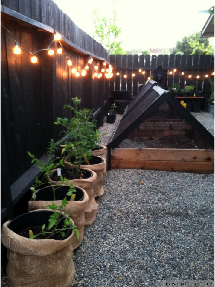
So many times I wait to share a project around the house because it's not quite yet finished. But there is often an exciting moment to be shared at each project milestone. We recently finished building the foundation for our edibles garden and even in its half-done state, it gives me a little thrill each evening when I round the corner to see what we've accomplished.


We have our share of nightly crawlers - raccoons, possums and skunks among them. To keep our future bounty from being picked over each night, we built a screening system for the redwood raised beds we built last year, that would allow us to batten down the hatches so to speak at the end of the day and preserve the day's growth. Each side screen can be lifted and propped up with a 2x4 during the day by the pretty brass handles my husband installed. An eye hook secures them to the bed once reclined again each night.  The beds themselves also got a bit of a reboot. I sanded and then weatherproofed them with a soy-based sealer to help keep the wood from drying out under the hot California sun this summer.


Our herb table serves as a backdrop to the rest of the garden.  Before planting, I painted various pots - some new and some old - black for a uniform palette. I love how the deep hue of the pots brings out the colors in the foliage. A wall fountain once handed down to us many years ago got a fresh coat of paint and new motor and now presides happily over our flock of herbs and cacti sitting on the table below. I'll be sure to get a few more shots of the table itself at some point, built from a pile of old cinderblock and spare lumber we had stacked up out back. The cinderblocks were painted black as well and blend discreetly into the adjacent fence line.


The view of the garden on approach gets me every time. You can glimpse a peek through the lemon tree from our pool. We had that in mind when we hung the string lighting along the fence. The Mister wanted a bocce court. I wanted vegetables. In the end, we came together and made this little piece of heaven for ourselves. Even though the beds still lay bare, it's become one of our favorite little corners in our yard. 

***Here's where we started and finished back in 2012

photos by holtwood hipster
SHARE:

Thursday, April 24, 2014

Guest Bath Redux // ORC Week 4

It's already Week 4 of the One Room Challenge and today I'm linking back up with many of my fellow 'design addicted' web-mates over on Linda's blog Calling it Home to showcase my progress on the one room that has been a challenge for me over the last three years. I'm not going to beat around the bush today... by the end of this post, I'm going to pull back the curtain a bit and reveal my favorite part of this guest bath transformation. 


But let me first lay the groundwork. The palette for my guest bath design really took shape from what would become of the counters. I knew all along the adjacent walls would be white and because we have already had a lot of success with Benjamin Moore's 'White Dove' elsewhere in the house, I decided that color would also appear here. I tested it against a brighter, truer white, painting a swatches right beside our dated bath tile and 'White Dove' won out for it's creamy undertones. Plain and simple- it actually complimented our tile quite well.

On the wall, 'White Dove' looks fresh and clean. I plan to pair it up with some of creamier tones to compliment and balance earthy colors that made their way onto our vanity. Mixed metals is my jam, so I'm mix-mastering it up with both polished and brushed brass accents and chrome fixtures.

The whole bathroom reno centers around these counters. You may have thought it was all about the paneled walls. That was a happy side outcome. What really motivated me to focus on this room for the ORC was the fact that I saw no end in sight to the 7 feet of outdated, shiny black laminate countertops. It was one of those unfortunate relics left behind from the previous owner that nagged at me day in and day out as dust and watermarks constantly blanketed the surface. A 7ft piece of stone is out of our budget for the moment, so I set to scheming, intending all along to transform this blight on my bathroom into the concrete counter of my dreams.
 There are many tutorials on Ardex Feather Finish applications out there. Though it is intended to fill cracks and smooth concrete flooring in preparation for tiling and other professional finishes, I may have found my soulmate in this versatile product. I tested the waters on a smaller wet bar counter in our dining room and realized through that experience what tools I would need to make the lengthier vanity top a smoother experience. In the end, I used everything from concrete and drywall tools to my mini cake spatula to get just the application I wanted. Three coats of Ardex, sanding in between with 220 grit paper and two coats of sealer later and I had it, the concrete counter of my dreams. 
For the first few days thereafter, I thought it couldn't get any better. But then, I found the paint color for the base drawers and cupboards. I thought for sure I'd go white or dark charcoal gray. I'm glad I decided to take a chance with Benjamin Moore's Aura line and a greenish-gray they call Rainstorm. I mean... I walk into the room just to stare at the richness of it all day long. In a surprise development, it's the scene stealer- not the glorious concrete countertops after all. The matte counters, flat color on the cabinets and polished brass pulls reassured me that I was moving in the right direction with this reno. That leaves just two short weeks to iron out all the little details before the big reveal. 

You can read about my plan and weekly progress here:


Be sure to check out progress by all the talented bloggers linking up today over at Calling it Home.
SHARE:

Tuesday, April 22, 2014

Make This // Lobster Cage Pendants


Where do you want your lobster traps hung? We were getting ready for a little shindig at the house over this past weekend and thought we'd add a little mood lighting in one of the far corners of the yard with the bamboo pendants I had made the week before. Until then, I didn't see it. I had envisioned calling them "netted bamboo pendants" or something of that sort for this post. But it wouldn't be the first time The Mister saw something different than I did in one of my projects. 

Lobster cage or not, I liked them. I liked them a lot - especially once the black netting harnessed the soft glow of the filament bulbs we placed in them that evening for our party. 

They were a cinch to put together too. Here's how I did it:


I took inspiration from the Ay Illuminate pendants I gushed over in a recent post. Though much more low brow than the fancy designer pendants I have such an affection for, I think my version captures a similar vibe - no fuss, rustic simplicity using minimal materials to create a statement all its own. 

SHARE:

Thursday, April 17, 2014

Guest Bath Redux // Week 3 One Room Challenge Link Up


It's time to link up for Week 3 of The One Room Challenge and today I'm sharing more developments on what we are calling our Guest Bath Redux. A 6-week deadline is motivation enough for steady progress and wouldn't you know, we're moving right along with this renovation and have finally gotten into some of the prettier moments and lighter DIY projects. 

Not caught up yet? You can always read more about the game plan (Week 1) and the most impactful change to come out of this renovation (Week 2) in earlier posts.


----------------------------------------------------------------------

Perhaps we should really be talking paint colors before accessories, but that post will have to wait. You see, I'm holding out on the paint discussion because that will also involve the vanity and well... I'm just not yet ready to reveal that perfect little piece of this puzzle. So let's get to some of the other ways we're working to achieve our desert.modern.luxe vibe for this galley bath. 

Gold Leaf Mirrors
I took an evening and gold leafed both of the existing Ikea Grundtahl mirrors. I had kicked around the idea of spray paint, but decided in the end that the result would be too flat and not really arrive at the right contrast I was hoping for against the pristine white breadboard backdrop. I opted instead to apply Gold Leaf sheets and even left some of the areas around the frame looking a bit distressed. 


Vanity Stool
I've had a deco style vanity stool sitting alongside the tub for months now. I had picked it up on a whim at Home Goods, sure that I'd eventually give it a little makeover. While most of the other elements in the space will remain neutral, I'm looking to add a little pop of pattern or color to the room through this stool. Those chrome legs might even end up gold. I'm still up in the air on that one, just as I am the final pattern for the seat, though I'm currently floating several potential solutions.


 Gold Pendants
Speaking of gold, the commercial grade stainless finish on our IKEA pendants (discontinued) got made over with my favorite Rustoleum spray paint. The shiny gold bases are the start of the mixed metal look that I'm planning to weave throughout the bath. We saved a little dough by recycling the fixtures, while  achieving an elevated look in just a couple of quick coats. Win, win. 


  Shower Doors
Sayonara you dated and mismatched shower doors. Oh I couldn't wait to get rid of you! True, their absence now reveals a dated square tile backsplash, but I'm going to make lemons from that lemonade. The tile is white and in good shape, as is the tub so I'll be polishing that 80's tile job up and will make do for the next 5 or 6 years until we are ready to really renovate the shower area. For now, it's appealing to my love of all things "geometric" and it's staying.

So that's where we are at the half-way point on this project.  Next week, I'll let you in on the some of big makeover changes happening along that 7 foot vanity. 

Until then, be sure to check out some of the progress by my determined and talented blogger friends linking up with Linda today over at Calling it Home.


Follow along on Instagram for continued ORC progress and sneak peeks!
SHARE:

Tuesday, April 15, 2014

First Look // Project Green Garden Screen


One of the bigger projects on our Spring 2014 punch list was to build out a set of planters that would sit along 24 feet of fence line adjacent to our pool. This is a high profile area both from the inside of the house and from the pool deck so we wanted the final outcome to pack a good visual punch. In previous years, we'd tried planting various vines and bedding plants directly in the ground along the fence line, but were unsuccessful based on limited planting space, soil condition and heat/sunlight in this area of our yard. Our solution was to take the plantings above ground where we could have more space and control over the soil and fill it with heat tolerant greenery that would eventually grow and give us some of the height we also desired.


The original plan called for bamboo. Fast forward through weeks of research and local sourcing and what we learned was that our USDA zone limits us to just a few heat tolerant/full sun clumping varieties (we just didn't want to take the chance with runners) - none of which we liked the look of. There was one variety that we could have shipped in from Florida, but that was cost prohibitive. So we examined other "looks" and plants and found ourselves at Home Depot last Friday night with a cart full of Podocarpus and Japanese Boxwood. 


We had built out and stained our boxes in the weeks before. We also coated the heck out of these guys with a marine grade finish and lined the insides with plastic, taking care to leave holes in the bottom for drainage. Before planting our new flock of flora, we also filled the bottom of each box with gravel and bark chips to aid in drainage. Then we filled... and filled... and filled each with roughly 6-8 cubic feet of soil. 


We had some leftover decorative rock from another landscaping project out front and topped off each of the boxes late Sunday afternoon. Though Podocarpus can grow some 30-40' tall into a full grown tree if planted in the ground, we plan on keeping it trimmed to create more of a formal hedge look as grows out. The Japanese boxwood will also be trained and trimmed into shorter spheres in the interim. Perhaps at some point, we'll remove the boxwood and allow the Podocarpus to grow together. We'll see how things progress. For now, we're both really satisfied with the outcome and delighted to have a little greenery along this stretch of fence at last.
SHARE:

Thursday, April 10, 2014

Guest Bath Redux // ORC Week 2


If I have one design quirk, it's my tendency to approach a project with a gross underestimate of time, money and ease (was that just one or three quirks?). I must confess that I've become a little notorious for convincing both husband and dad that whatever idea pops into my little head will be a snap with little hit to our pocket book. Though they may know better, I'm lucky these two fellas love me enough to help me make all my little plans and imaginations come to life. Take note of this piece of trivia, for it becomes a factor in the rest of today's tale. 


It's Week 2 of the One Room Challenge and today, I'm linking back up with an update on our Guest Bath Redux. You can read more about the One Room Challenge, created by Linda of Calling it Home and the Link Up I'm participating in right here.  

Last week, I shared my plans to give our primary guest bathroom a 'desert modern luxe' feel to sync up with the rest of the house. Today, I'm diving right in to share the first and arguably the most impactful element in this transition - the newly paneled backsplash behind the 7 foot vanity.  While formulating my plan for this space, I kicked around several ideas for this wall. But in the end, two things really drove the decision to go with V-groove paneling.

No window // The bathroom sits right in the middle of our floor plan with no window (peeve). We have a standard fan for ventilation, but ultimately I could not bring myself to paper a wall where it would inevitably succumb to condensation. Did I mention that while this is our guest bath, it's actually my favorite place to shower? 

Cost // We only needed to purchase three, 4x8' sheets of paneling. At $75 total, this was an inexpensive way to add visual interest and a contemporary backdrop for the rest of our makeover plan.


We also really liked the way it looked in inspiration images I pulled and the fact that it mirrors other paneled elements in our home made this a no brainer. A happy side effect was that once hung, the paneling also made this galley bath feel much larger and more open - the biggest win in my opinion.

But I naively approached the job with a "we'll just cut it and tack it up on the back wall" attitude. Dad had spent a little more time mulling the idea over and once we dug in, I understood why. Unless you are working with new construction (and even then it's iffy), walls never seem to measure the same height or width from one point to another. The mere fact that we were working with a pre-determined, lined pattern in the paneling would only accentuate this problem- and truth be told, it did.

We had decided to wrap the paneling around the short adjacent wall that feeds into the vanity area. It's the first focal point you see when you walk through the door to the bathroom so it had to be straight. Dad knew to start there. But lining up the paneling once we got to the backsplash revealed what he already suspected from the early project assessment. We'd end up with uneven spacing between the grooves at both the top near the ceiling and bottom at the vanity edge. It didn't help that the 40 year old vanity was not quite level either.

What should have taken only a couple of hours to complete turned into quite a custom paneling job, some extra spending and a good 12 hour day to get it right. Lots of learnings right out the gate. In the end, it all turns out more than ok, I promise. Be sure to check back next week for another update. I'll dish on some of the pretty already happening in here and share some of the easier to tackle DIYs that are helping to bring some of the desert luxe into our more modernized space.  

________________________________________________________________


SHARE:

Tuesday, April 8, 2014

Around Here // House Updates

We're moving right along through our Spring '14 punch list. Most weekday nights and days off lately have been spent out in the yard, painting walls or hanging hardware. It feels good to see rapid progress on some of the things that we've wanted to address for so long. Today, I wanted to give an update on a few I've previously blogged about so you'll have hard evidence that it's not just a bunch of ideas I'm floating on these pages. These house dreams really are in the making.

Project Green Screen // If you're new to the blog, you'll find a brief backstory here. The wood planters that will flank 24 feet of our unsightly back fence have been constructed, stained, lacquered with a marine grade finish and then... deconstructed to reduce their size once we realized their massive footprint under the original 2x6' plan.  The abbreviated version works so much better and is now sitting ready for the bamboo that will be planted over the coming weekend. 

Concrete Bar Top // As I was exiting for the weekend, I hinted that I might just hit our dining room wet bar with some Ardex Feather Finish and give that 1980's laminate countertop a more modern look. Well, I did it and it turned out exactly as I had envisioned.

Counter Height Bar Table // We debated different versions of custom table legs for over a year, while our mahogany top sat propped up against the back bedroom wall. Now, it happily sits on a pair of black, powder coated steel legs created for us by TRRTRY. We found this SoCal workshop through Etsy and couldn't be more pleased with the result. The accompanying stools are still in the works.

Dining Room Art // Our day spent trekking around the Martian landscape of Joshua Tree was all really intended to produce a one of a kind piece for our dining room kitchen. I shared some outtakes from that outing here. Scanning through the photos back home, we knew we had "the one" shot we were hoping for all along. The 40" x 40" enlargement is being framed up this week and will finally hang on the wall backed with Erika Wakerly's 'Angles' paper.
SHARE:

Thursday, April 3, 2014

Guest Bath Redux (Week 1) // One Room Challenge Link-Up


I'm always inspired by the dramatic transformations my favorite design bloggers come up with as part of the annual One Room Challenge, created by the amazing Linda of Calling it Home. Today, I'm joining in on all the fun as a linking participant to share a one room transformation of my very own with all of you. Over the next 6 weeks, I will be partying it up with others linking in and will unfold a behind the scenes look at a Phase Two renovation on our primary guest bath. 


My budget is slim, so I'll need to be really resourceful in making my bathroom reno dreams come to fruition. For this Week 1 post, I'll give you some hints on the direction I'll be taking. 
But first, a little context. 
When we moved into our 1967 Rancher 3 years ago, we immediately tackled some of the more unsightly elements of our guest bathroom. We were having ceiling and lighting work done prior to move in so we took that opportunity to get rid of the bathroom soffit and fluorescent lighting it housed above the 7 foot vanity. Initial budget spread far and wide, we always knew we'd have to live with the black laminate counters, mismatched shower doors and aging square bath tile for a while. So we gave it a good scrub, painted it up and added some shiny new hardware. In year two, I gussied it up a bit with some fun, deco-inspired striping on the walls and there it has remained, waiting at the back of the line behind other, more critical projects. 

I started to formulate some ideas for the Phase 2 reno and came to the conclusion that we could easily take this room to the next level with just a few inexpensive, high impact projects, a little elbow grease and of course, my long suffering with this never ending house renovation, but always willing to lend a hand... Dad.  So I squeezed this one onto our Spring 2014 punch list and decided a 6 week blog deadline would be the perfect strategy to help bring a project I couldn't wait to tackle back up to the front of the line.  


As for the plan, I'm taking this baby far out into the California desert to sync up with other design-work around the house -  a bit more modern and a little bit luxe.  I'll be embracing most of what we already have, though much of it will undoubtedly have an entirely new look. There will be DIY projects galore, dictated partially by budget and partially by my own naive notion that I can do almost anything myself. I'm sure there will be a meltdown or two, a few glasses of wine and some long days and nights to get 'er done in 6 weeks. But I'm up for the challenge (and you know, Dad says he'll help with the big stuff). 

Meet you back here next Thursday for a progress report.
SHARE:
© Holtwood Hipster. All rights reserved.
Blogger Templates by pipdig