Thursday, February 28, 2013

All the Rocks That I Got


Aren't these agate and druzy Ondo Rings by Rablabs just the absolute most

Each of the unique designs and patterns in these rings resulted from water that rushed through ancient lava streams. Diamonds may be forever, but I like the idea of these edgy, geological creations sparkling away on my finger. 

Come to think about it, I'm liking the thought of them sparkling away in my home as well. 

Today, I'm over at Erika's blog and I'm turning the spotlight on this stone age revival we seem to be having right now. Hop on over to Shop Talk for a round up of my picks to help you get this rock solid look in your own home.


SHARE:

Wednesday, February 27, 2013

Project Reveal // Modern Exterior Wood Screen

I thought I'd share an update on the big project we've had in the works here around Holtwood House - the one that has been consuming every ounce of free space in my brain over the last couple of weeks while we watched it come to fruition. These things take a lot of thought and patience and I've been overflowing with thought and coming up short on the patience lately.

This is the one obstacle to us finally landscaping the front yard and for two years now, I've been envisioning it. But even if we temporarily fooled ourselves into thinking we could just slap some boards up on a couple of posts and call it a day, we knew in the end that nothing is ever as simple as it seems.

Fortunately, we have an ace in our back pocket and he's overflowing with both thought and patience (most of the time- wink, wink Dad). See Dad had other ideas- the kind composed of augers to make post holes deep enough and levels and nylon string to make lines straight and evenly spaced. He advised on the right screws to keep rust at bay and the appropriate poly to weather proof and add luster to our grains.

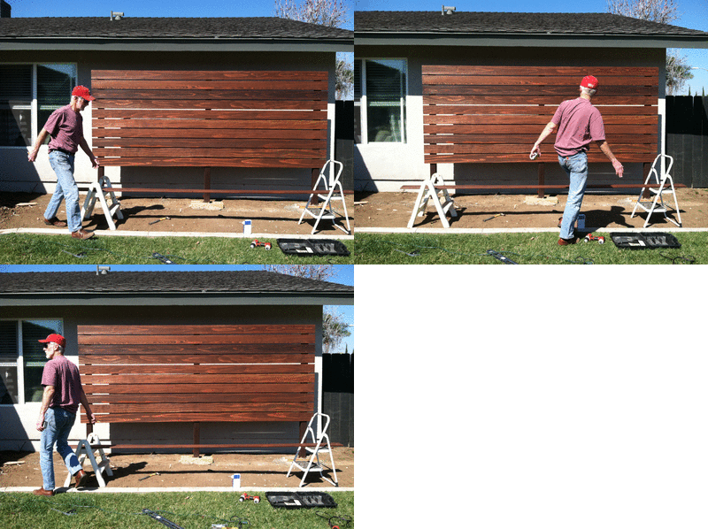
So when he showed up at the crack of dawn last Saturday to erect this most modern of screens, The Mister and I knew the day would result in exactly the look we were after, but go a little something like this:

picasion.com


The man is a machine.

That's not to say that The Mister and I didn't put a little sweat equity into this thing. Yours truly sanded and stained all 144 linear feet of those boards and The Mister spent the previous Saturday learning how to use that auger. Good times.

But so, so worth it, no?


So here she is in her current state: up on her legs with the first coat of poly. After some more sanding and coating and a whack or two to the blocks down below, she'll finally get some sleek address numbers, a wash of lighting and a parade of plants at her feet.

Completion of this project of course has lead to additional work we must now take on. You know how mom and dad always taught us all to take care of our stuff and it will last a life time? Well we'll be putting that into practice by outfitting the eaves with new gutters to keep rainwater at bay.  There will also be some yearly maintenance like sanding and re-finishing to keep the wood protected from both sun and water.

Two years of waiting. Two weekends of work. A lifetime of maintenance. But we couldn't be more thrilled with the outcome- or more thankful for Dad.


SHARE:

Tuesday, February 26, 2013

Clean California Minimalism // James Perse


When it comes to defining my personal design style, there is perhaps no better a representative than James Perse. Some people ogle french antiques or stick strictly to mid-century masterpieces and while I can't say I'd never, my first love just might be clean, Californian minimalism - and I'm not sure anybody does it better by me.

But any true Californian would also tell you that regionally, we tend to swing towards a subtly distinct aesthetic. Luckily, the savvy design team at James Perse caters to us all with several furniture collections: Los Angeles, Nor Cal, Malibu and Brentwood.


Can you guess which one I am?


Undeniably Angeleno.

If you had to pick, which would you choose?


SHARE:

Monday, February 25, 2013

Looking Back // 2010 Oscar Viewing Party

In hindsight, I probably should've shared this with you all last week. But it was really last night's more subdued Oscar viewing that had me reminiscing about a past party we threw when we lived in our little back house several years ago. First, let me tell you that The Mister and I are infamous for the "pop up" party. We sort of decide, oh about 10pm on a Friday night that we want to throw a real, honest to goodness cocktail or dinner party the following evening and somehow, end up making it all happen. That's kind of how this one evolved. I was anxious to test out some dessert recipes I had come up with for an upcoming wedding I was catering and thought the evening would make the perfect occasion. So it was that we pulled together a few inexpensive rentals on Saturday and proceeded to move all the furniture out of our little living room so that we could have ourselves a proper Oscar-worthy affair by Sunday evening.

I had read a story behind the floral arrangements that would be in the Governor's ballroom that night and did my best to mirror that arrangement for our own table. It actually came out quite similar! We rolled out the red carpet for our (very surprised) guests and played paparazzi as they came walking to the door. Of course, we also had our own mock ballots at the ready and had ourselves a little competition to see who had correctly predicted the winner in every category. Dylan even got in on the action with his little bow tie to match the set of tails nature gave him.


It was such a good evening spent with our nearest and dearest and one of the last parties we threw in that little back house - which over the course of 10 years, had seen many, many shindigs.

If you'd like, I thought I'd periodically look back at some of those events we hosted. Many of them were quite elaborate and I think it's always fun to see how even our entertaining styles have evolved from what was once tight quarters to the now bigger house, designed for entertaining.


SHARE:

Wednesday, February 20, 2013

Art Crush // Eric Zener

Cusp
I can give you so many reasons why Eric Zener's artwork appeals to me - particularly the water paintings. It might be that I can actually imagine the shock of cool water colliding with my sun-warmed skin when I look at 'Cusp' or 'Safety Net'. I might just be mesmerized by the perfectly blue reflective water he paints in 'Much Clearer Down Below' and 'Anonymous Time Traveler'. But most of all, I think it's that he manages to encapsulate everything I love about summer right there on a canvas- the warmth of the sun, the floating, tanning relaxation of it all and most certainly, the fun in splashing around in the pool for three months.

I want one for this house that unconsciously seems to orbit around our backyard pool deck. 

Metamorphosis
Much Clearer Down Below
Splash
At Ease on the Edge
Anonymous Time Traveler
Going Even Deeper
There's more of Eric Zener's work to pine for right here.  Don't miss his incredible "Sleep" series.
SHARE:

Tuesday, February 19, 2013

Weekday Siesta + Plans for a Backyard Hammock

I know it's only Tuesday and many of us have just enjoyed a long holiday weekend, but who's up for a little weekday siesta? I know just the place... 

As far as I'm concerned, there are few things as transportive as a hammock. There is a little 10 room hotel out in the California desert where one summer not too long ago, The Mister and I retreated to after a particularly long and stressful work week. We arrived wired, tired and disconnected. But I'll always remember how quickly that all dissipated once we eyed the hammock the hotel had stretched out between two trees by the pool. We couldn't throw down our luggage and kick off our shoes fast enough. Together we climbed in and just like that, we were somewhere else, far, far away... just the two of us. 

Inspiration Images 1 | 2 | 3 | 4
In our never-ending quest to make our home truly a retreat for ourselves, we've continued to work on the poolside layout and have made plans to incorporate a hammock. There are so many to choose from, but I've personally got my heart set on one of these beauties:

Veronica Colindres on Etsy


SHARE:

Friday, February 15, 2013

Happy Weekend // A Great Week In Blog Land

Source

Ah... the weekend. It's finally here.

I expect it to be busy, but in the best possible way. We're getting started on building out the wood screen and I see a little puttering around, planting, staining, making plans over the coming days as well. After months spent dreaming of progress, there shall finally be some around the house once again.

But we're leaving behind a great week out there in blog land as well. Here are a few standouts that caught my attention.

+ Kristen's Heart.Love video. Did you see it? It was one of the sweetest things I saw this week.

+ Speaking of sweet, did you see the girls luncheon Albertina shared? That flowerless chocolate cake!

+ I've really been enjoying Bailey's recaps on how her new Houston home came together. But as one pulling a relatively new house together myself,  this fearless read last week really hit home for me in so many ways. Did it do the same for you?

+ Erin always has the best ideas! She shared the creative way she's leaving love notes behind for her husband while traveling for work.

+ I'm not sure there is anyone who does not love Bri Emery. She shared what was in her business lady toolbox on Design Sponge this week and something she said gave me a little punch to my gut.

Do you know your own value, and are you prepared to assert that to others?

...Great advice for anyone- business startup or not.

Happy weekend friends.


SHARE:

Thursday, February 14, 2013

The Things We do For Love

The story goes that in 1957 Jayne Mansfield and Mickey Hargitay purchased their beloved Pink Palace mansion in Beverly Hills from Rudy Vallee for a sum of $76,000. One of the pre-conditions of marriage was that Jayne would have the heart shaped swimming pool of her dreams. And so it went...

I encourage you to check out some more old photos of the fabulous Pink Palace, courtesy of the blog Curious Places. Lots of heart shaped, cotton candy goodness for this sweet holiday.

 Original image via Architectural Digest, April 1996

SHARE:

Wednesday, February 13, 2013

Playful Patterns // Geometric Tiles

Cathy Kincaid
Ask anybody who knows me well and they will tell you that I'm most certainly in the go big or go home camp. While I'm a bit predictable in that way, I've always loved that I can still surprise with just the right grand statement. 

I've been exploring ways to update both bathrooms in the house and in my searching, I've become a little enamored with the effect of bold, angular and geometric tile work.  I've always gravitated to paper- it's a definitely more wallet friendly and given the fact that I am prone to changing my mind often, a couple of rolls on the wall would be an easier sell to The Mister. 

Oh but look what can be achieved if by some masterful tile work! 


Can I tell you how much I love this Dandelion tile by Marrakech Design. The color here is called 'lawnmilk' and while I would not normally go for green, I think the color and pattern combo is crazy good here. If I want to play it a little safer, there is also a grey/white color way.


Don't even get me started on the hexagon penny tile by Datile used in this remarkable bathroom. From a distance, I see ikat. 


These ceramic stone tiles by Daniel Becker radiate heat. If we lived in a cooler climate, these might be perfectly used lining the wall nearest the tub.

Ann Sacks |  Maria LladoArquitetura Paralela
Some of these designs are all-in-one pieces, while others are composed like works of art to create the desired pattern. I'd shower in the middle one any day of the week thank you.

AKDO
Kelly Wearstler

I also favor the deco spirit of the three above. But despite the consistency of the triangular pattern, these are at home in very different settings. My favorite is the black and white version photographed by Idha Lindhag for Elle Decor above, laid against the warm wood countertop and sleek gold faucet.
SHARE:

Tuesday, February 12, 2013

Steal This Look // Valentine's Day


Valentine's Day always seems like the perfect occasion to kick up my normal look. Right now, I'm loving this fresh-faced, come hither spin on the typical bright red lip. 

//. Forego the smoky eye or heavy liner this holiday and dust both your upper and lower lids with highlighter instead.

//. Nothing is sexier than rosy, healthy cheeks.

//. Leave the mulberry lips back in Fall and spring forward with an electric orangey-red.
SHARE:

Monday, February 11, 2013

Grab Some Wood There Bub


This is a post about some really great grains, beautiful stains and one big ol' pain.

Throughout our renovations process, I've noticed that once in a while, whether by way of some  magical cosmic plan or by sheer coincidence, multiple and otherwise unrelated projects will collide into a singular and consistent focus. Right now, Holtwood House projects concern all things wood.

Today,  I thought I'd share with you all the planing, staining and splintering happening around these parts.

Project One
What: Wood 'privacy' Screen
Where: Front of the house

I recently told you about the screen we are working on out front. For two years now, we've envisioned the day when we would choose our lumber and get to work on this baby and over the weekend, we took our first step.

There are several lumber yards in our area, but working off a tip, we decided to take a road-trip out to Peterman Lumber in Fontana, Ca to peruse their selection of domestic and exotic hardwoods.

The verdict: a must visit if you are in the So Cal area and are looking for something special. We found exactly what we needed (at no additional cost) and did not have to have our wood custom milled like we would have had we gone locally.

There was so much to see at Peterman. Intricate moulding, reclaimed wood, exotics like zebra wood, balsa (whoa- there are some fun projects to be had there) and just about every variety of mahogany under the sun all caught my eye.

For our purposes, we honed right in on their selection of pristine redwood- free of any knots or imperfections and serendipitously found the exact cuts and lengths among the pile (see first image).

Next steps on this project: build it!

Project Two
What: Custom Counter height dining table
Where: 'Formal' dining area


There are other projects that have been worth the wait as well. Take this custom dining table that is nearing the final stages and will soon be up on it's legs. We purchased the raw pieces of African Mahogany some time ago and had a knowledgeable friend glue and frame it up for us. But, while other projects beckoned, there it sat untouched for the better part of the last year, a glaring reminder of yet another project that had to be completed.

We wanted a particular kind of finish on this baby- polished, but matte. We also had to consider that any product we applied would change the color of the wood. I did a lot of research into just how we should go about finishing it and in the end, deferred to my favorite experts Morgan and Anna for the 411.  Over several days, I finely sanded and applied several coats of Danish Oil (in natural) before polishing with four coats of Howards Feed + Wax. So happy with the outcome!

Next Steps on this project: Order the custom hairpin legs and get it on it's feet.

Project Three
What: Stain Perimeter Fence
Where: Backyard


We also got to work on staining the 150 feet of back fence.
25 feet down.
Suffice it to say, I slept with a heating pad last night.

We chose Behr's 'Slate' and by Spring, when the yard has recovered, the plants are going to look amazing against this smoky backdrop.

Next steps on this project: Take it one day, one panel at a time until complete.

SHARE:

Friday, February 8, 2013

Fancied Up Votives


While preparing for last weekend's Super Bowl festivities, I threw together something very simple that I thought I'd pass along. Knowing the game would run well past dark, I wanted to create some ambience at the outdoor bar by adding a couple of candles. I mean, who doesn't like a little candlelight with their football? 

Truth is, I always get a bit nervous putting lone votives out onto a table for fear of them getting knocked over or that somebody will unknowingly drag their sleeve across one. So being the paranoid I am, I plopped the votives into a couple of lowballs and proceeded to create a little moat between the glass and votive with some rocks and minerals I had stored away for an upcoming project. Once lit, I thought they put out the prettiest glow. The translucent surface of the crystals and all the pretty veining were instantly illuminated.

It just gave my little bar display a little extra... something. I might even try it on a larger scale in other areas around the house.

It's the weekend friends!

Here's hoping the next couple of days off include a little candlelight of your own.

SHARE:

Thursday, February 7, 2013

Small Change // Big Impact


We recently added a mirrored backsplash to the wet bar - proof positive that even little changes can sometimes make all the difference in the world. 


Here it was then, all dressed up for a holiday gathering. Here it is now, shiny and bright and currently at least, uncluttered. Eventually an edited arrangement of bottles will come back down onto the countertop. For now, I'm relishing in the new-ness of it and want to see as much of the new backsplash as possible. 

Final Cost // $35.

How // We had the mirror pre-cut by a local glass company and adhered it directly to the wall using a non-silicone based adhesive for mirrors. It took just 24 hours to cure.

Avoid this pitfall // I originally measured the width of the space by running my tape along the back wall where the mirror would eventually be placed. Should you want to do something similar, you will want to want to measure both along the back wall and again towards the front, taking into account any obstacles that may jut out from the sidewalls. The rock facade on the back of our fireplace required a smaller cut and another trip to the mirror company because I did not originally factor this in.

By the way--- thank you for all the lovely feedback on yesterday's post. We are really pleased with how  this space evolved as well!
SHARE:

Wednesday, February 6, 2013

Around Here // A First Look At Our Entryway


One of my favorite things about our home is the front door. With it's stately nod to 60's ornamentation juxtaposed against more serious, modern hardware, it really sets the tone for what you'll see once you cross the threshold- contemporary patterns and color at play with features that have remained original to the house.

I shared that I had recently purchased the southwest inspired runner and promised that once in place, I'd sneak you a peek at how it all came together. Well today, I'm inviting you all in for a first look at the nearly finished entryway in our home. 


UPS rang the bell and I couldn't roll that pretty blue runner out quick enough. I was so worried that it would not blend well with the original tile floors (that for the foreseeable future are here to stay). But I think it works and I was relieved to stand back and see my initial vision for the space taking shape.


Come to think of it, I'm not really sure anymore which came first. Perhaps the arrival of the runner dictated some of the other changes in the entryway, namely the infusion of color through additional artwork. But I think we've been working in this direction all along. The original vintage painting that greets us each time we walk in the door was one of the first purchases we made after we moved in and once hung, I think we always knew that this space was destined to be a happy and colorful welcome to visiting family and friends.  The adjacent album cover artwork is a more recent addition and pays homage to our love of mid-century era orchestral jazz. There is always music playing in our home.


The upholstered footstool was another recent addition, pulled from my studio workspace. Here it offers a convenient place to throw on our shoes before we head out the door again. I also pull it into our living room and use it nightly to kick my feet up in front of the TV. I'm tossing around the idea of adding some brass hardware to the white cabinets (that house all our party platters!). For now though, they remain clean and free of any added decoration.


I've struggled with just how and where to incorporate personal photos in the house. They are after all, an essential dimension to any lived in space. But while I admire gallery walls constructed of old portraits and family memories, I've been guarded about cluttering up our walls too much- yet. This built-in alcove in the entry felt like the best place to finally display framed photos of our nearest and dearest. It's still a work in progress, as there are a few photos to be added. But even as is, I like the way the black and white prints placed in chrome frames unify our carefully curated collection.

The entry area is still one of the most complete in the house at this point. But all these recent updates also remind me that the dream house we are building is finally starting to come together. 

Sources // 

Original door painted Glidden's Almost Aqua
Door Hardware via Lowes
Original Artwork found at Long Beach Flea Market
One of a kind runner found at Rugs USA; Similar ones still available
Footstool, Bull sculpture and frames all from Home Goods


SHARE:

Tuesday, February 5, 2013

Fresh Ideas // Story Hotel

I love that I am still surprised by design. You would think that with so many images I see in a week that it would be nearly impossible to do, but there I was just last week, scanning the dailies on Pinterest when I stumbled upon this image of a guest bathroom at the Story Hotel in Stockholm, Sweden.  I must have left it and come back to it several times before pinning. You see, it's not necessarily my style. But one of the things I love most about this space is that it pushes some of those uncomfortable buttons for me and makes me think that even I might adopt some of its freethinking, bohemian ways when designing a space that is more aligned with my tastes and style. 


Take the way different metals are used in this bathroom. I've struggled a bit with this in my own home. Do I have to stick exclusively with chrome now that we've invested in those pricey kitchen pendants? Is it possible to mix in some brass hardware in my master bath now that some of my tastes have changed?  This bathroom happily marries brushed and polished, brass and chrome and reassures me that I just might have some flexibility to change direction now that my preferences have evolved.

Then there's the minimalist pendant. Perhaps it works only because there is so much natural light reflecting through the windows and off all that glacier white tile. But it has appeal, no? I've long thought about how I could incorporate one (Morgan has her own design coming out soon and I'm ready to pull the trigger on that baby). But I'd honestly never thought to put one in a bathroom- until now.

This space also breaks all the conventional rules telling me that sinks in a bathroom have to be white- and match for that matter. These painted porcelain bowls add whimsy and are an unexpected show-stopper- a hard feat considering the competition brought to the table with that polished brass countertop.

Image found via Studio Karin
SHARE:

Friday, February 1, 2013

Super Bowl + A Birthday

Friends, Game Day is nearly upon us and while I can't admit to being a fan of either team or the sport, I'm always up for a little celebration, pageantry and nostalgia. It just so happens that Super Bowl coincides with my birthday, so perhaps that'll work to set my spirits high. 

So give us a shout, raise your beer champagne glass and let's share in a little toast this weekend! 

PS... 
How awesome would some of these look blown up for party decor or used as a mural on loft or bedroom wall?
SHARE:
© Holtwood Hipster. All rights reserved.
Blogger Templates by pipdig