 |
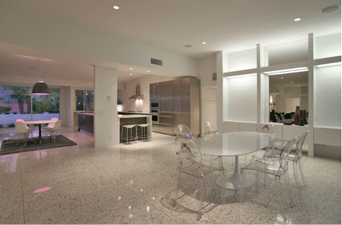
| Juxtaposition Home in Newport Beach, CA |
My inclination was probably fostered by the bold painted wood letters that hung over my bed as a kid. It sort of branded the room as my very own space and I remember looking up as I lay beneath the lime green letters that spelled out my name each morning, happy and content to be in my little corner of the world. It's probably one of the reasons this look particularly appeals to me for a kid's room or nursery.
These days, my affection for it probably has something to do with my love of fonts. I often find myself gravitating to those old neon letters and signs that have been pulled off buildings while walking the flea market. I also always get a kick out rooms that incorporate clever sayings spelled out in neon across stark white walls, the lettering so often quirky or fluid, with one letter bleeding into the next.
This look can venture into cheesy (but hey, to each his own). My personal tastes happen to swing either very classic or a little edgy and I like to see it used either very subtly or balls to the wall bold. So, I thought for this post that I'd feature three of my favorite ways I love to see letters and numbers used in decor.
Preppy // Traditional // Sophisticated
Bold // Whimsical // Vintage
Organized // Clean // Traditional
I spotted the letter montage above this week at a local furniture store. The use of mid-century type backed by rich textiles was such a fresh take, I had to include it here as one of my favorites. I've got my eye on this project for a future DIY. It's such a classic, masculine look. It'd be perfect for an office space or placed amongst some rich woods and buttery leather furniture.


.jpg)


