Wednesday, March 28, 2012

I Dream in Lucite

I aspire to a lucite console table- or perhaps someday even a delicate foot stool upon which I'd balance, while gingerly applying mascara to my lashes each morning. But what sweet translucent dreams I'd dream beneath a lucite canopy. 

Via
Via
Somehow, the quilt-like textures that lie at their feet seem just as dream inducing.
SHARE:

Tuesday, March 27, 2012

Modern Day Work Sheds

I've long dreamed of carving out some little niche in my yard for a separate workspace. I think this desire was born out of necessity- or maybe just pure insanity- when we once lived in our little back house by the beach. One of the two bedrooms in the house had been outfitted into an full fledged office, complete with all the unsightly media equipment that space could handle. It was always quite the juggle when we'd have house guests, blowing up air mattresses and such to return the makeshift home office to it's natural bedroom state. Add to that the bevy of sewing and art supplies, gift wrap and the like, and soon that little room was bursting at the seams and taking with it every bit of productive energy I had in me.

I was reminded of that time when I recently saw this custom workspace featured on Grassroots Modern.


It so beautifully solves that modern day problem of creating separate working and living areas at home. I was immediately drawn to all that gloriously stained wood- my obsession of late. The surrounding modern xeriscape creates further divide between the house and garden aspects of the property, with concrete pavers marking the way toward an easy morning commute.

It made me curious to see what other pre-fab solutions might be out there for those of us not so handy in the create-a-building-from-scratch department.


These window-ful stunners are by UK company In.It.Studios 


Poteet Architects, out of San Antonio, also came up with this colorful eco-friendly shipping container solution that has been making the internet rounds.


Speaking of color, Modern Shed offers some retro-chic options that can be customized to add a few extra hues to the garden landscape.


I'm still partial to the warm wood siding paired with the darkest of grays. That little shack would be right at home here at Holtwood House post-reno.

Have you come across others out there that have become your inspirational workday hideaways?
SHARE:

Monday, March 26, 2012

The Weekend in Pictures {3.26.12}


SHARE:

Friday, March 23, 2012

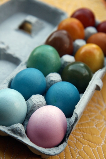
Rainy Day Craft: Dyed Easter Eggs

Via

We're expecting our first Spring rain this weekend, just in time for a big family get together we have planned. While typically our extended family brood would spill out of the house and onto the patio and backyard, we've decided this Spring shower will give us the perfect opportunity to do a little side by side activity. 

I haven't dyed Easter Eggs in many years. Heck, it wasn't even an annual ritual in our family while I was a child. But I've come across so many fun and unique decorating methods recently, that I'm feeling really inspired to add a little seasonal color to our home.

Rubber band method
Dip Dye method
Homage to CMYK
Thread Wrapped
Dyed with Rit (Pretty hues- but  not food safe!)
Naturally Dyed with Vegetables (Food Safe!)
Chalkboard Paint
(Ok, technically not "dyed" but just as fun!)
Marbelized
Lines and Letters

I may take a dipped approach to this project. Perhaps a little gold and neon action?


SHARE:

Thursday, March 22, 2012

How to Make Your Eyes Your Best Feature


There are so many things to adore about this songstress. But truth be told, Adele rocks a cat eye like no other. Long a lover of winged lashes, I've recently found renewed inspiration in the likes of both Adele and Angelina. I've been fiddling with my brushes, sampling different falsies and mascaras and attempting to recreate this look from my own vanity. But I've just learned that I've been doing it all wrong.


I stumbled upon a great video tutorial on Stylelist that shows you step by step how to create Adele's signature cat eye. It's pretty spot on. Apparently, I need to ditch the pencil and liquid wand I've been using and substitute them with a gel liner and square brush instead. 

I'm all over this look and not just for special occasions or night time wear any longer. The light metallic lid is still on the bright side of sultry. The shading on the brow line keeps it fresh and modern. But it's still a throwback to a time that was so effortlessly cool and chic.

I might even try my hand at some of these other fashion forward takes on the famous cat eye spotted over at Go Retro as well. 

1 / 2 / 3 

SHARE:

Wednesday, March 21, 2012

Go Big or Go Home


I'm searching high and low for this fabric- or at least a suitable option should it no longer be available. Anybody out there in Blogland got the lowdown on where to find this fabu-louz zig zag?


Images of Kelley Moore's Seattle office via Rue 

In general, bold, graphic textiles are on the ol' radar again. This time around though, I'm of the opinion that I should 'go big or go home' so to speak. I'm really looking to pack a solid visual punch in my own home office and think black and white would be the perfect counterbalance to all that beautiful, bold pattern.

Luckily, should I not find the broken zig zag of my dreams, there are plenty of other graphic selections out there to choose from.


 Stripes 1 / 2 / 3


Chevron 1 /  2 /  3

Remember this? These long-gone electrifying shower panels would have given my still unfinished workspace just the jolt I'm looking for.  


Now that I come to think about it... they would have been a fun play on poolside pattern as well. A little outdoor shower action maybe? But I digress...


SHARE:

Tuesday, March 20, 2012

Holtwood House Redux

Remember this post where I shared a bit about our plans for Holtwood House's upcoming exterior facelift? Well, an April start date is at last on the books. I think I've been planning and plotting for this since we first toured her.


She'll be getting brand new stucco, front windows, lighting fixtures, a little bit of concrete work around the planters, a shiny new paint job and a custom built privacy screen to camouflage a long patch of wall and add architectural interest. Our goal is to polish off the work with some modern textural grasses and other drought tolerant landscaping just before summertime. 

Part of the preparations over the next few weeks include selecting new lighting fixtures. I admit that the software I used to put the model above together was a bit limited in it's selection. We're likely going to go with something a little more modern and not so lantern-like for the sconces out front. Here's where my head is at (partial to 1 and 2):

1 / 2 / 3

These Andromeda planters due out shortly from West Elm will likely get placed on either side of the garage door as well. They're killer.


Of course there will be new house numbers that we plan to mount to the wood privacy screen like so... 

Via
And some other shiny metal objects elsewhere...


1 / 2 / 3 


Though if I'm being truly honest, we'll probably end up with more budget friendly, like-enough alternatives for the doorbell and mailbox.  

The plans are starting to come together out there. This old gal deserves it. She's been wearing the same clothes since the late 60's and it's high time she's had a make over.  


SHARE:

Monday, March 19, 2012

Kick Start

Saw and heard this quote several times in several places over the last couple of weeks. The universe must be trying to tell me something. 

On a related note, did you catch this fabulous post last week?  Making it a priority to exercise the wisdom in being "present in today".  

Image Via 
SHARE:

Friday, March 16, 2012

Is This Too Much?


I got a little surprise from my fella. Apparently we have a date with the Symphony tonight. They're screening Casablanca set to live orchestral music at Segerstrom.

I think Bogie and Bergman call for a little sprucing up, don't you?

Here's wishing some happy surprises come your way this weekend as well.

Image Via
SHARE:

Thursday, March 15, 2012

Project Reveal: New Office Bookshelves

One of the things I'm most grateful for here at Holtwood House is a rather large, bright, front-facing home office. It's a great space with plenty of room for a large desk, project table and comfy chair. There is also a nook of sorts, once a deep-set closet in the former bedroom with the doors now removed. I really wanted to utilize this extra area thoughtfully and initially considered using it to organize all of my craft papers, cook books and the like. I imagined an all-white system of shelves, folders, bins and boxes akin to something built from The Container Store. However, a little Web inspiration derailed that plan a bit.

Via
Via
Via
Via
Via
Via
Via
Via
I've always admired homes with carefully curated shelves, displaying the spoils of a well traveled, well collected life. You can easily get a sense of the person living in the space, where they've been, what their hobbies are, what little trinkets might hold sentimental meaning to them.  I have to remind myself now and again that I'm not living in the cubby-hole back house I once did and that I too can now indulge in a little display area of my own. I don't have to make frugal use of every inch of floor space any longer.

Flush with inspiration, I arrived at a new vision for the little nook in my office built around this:

Via
The shelves and brackets looked familiar- though I knew I had not seen them in gold. A trip to IKEA for some wall brackets and a coating or two of metallic spray paint would offer the same look.  Because it's a high profile area that was small enough not to break the bank, I also decided to use a higher end wood for the shelves. A visit to my local lumber yard and I had four ready-to-install pieces of Mahogany.

I did have a couple of temporary solutions in place that I wanted to incorporate into the final design- like the white EXPEDIT bookshelf, which would provide some structured storage and help break things up visually.

Via
This divine image (squeal!) also served as the inspiration for magazine organization. Previously, I had been using the IKEA Kassett cardboard files to tame my magazine obsession. But I thought this solution was the perfect way to bring my beloved collection back out of hiding. The all-white bindings still would provide the uncluttered visual I was originally after.

Here's what I started with. I had already begun down the road of organizing the glossies when I snapped this.

And here is where I am today with this project. It still needs a little styling, but I'm content with the idea that it will evolve organically, as I shelve items picked up from my adventures here and there. Some of the more colorful magazines are still kept under wraps. I had a few wooden files lying around that I simply spray painted black to keep the color palette cohesive with what I have going on in other areas of the room.

It also still needs some lighting. The black Mouille inspired long-arm sconce recently sold at West Elm would have been right up my alley. But sadly, I am too late to the party on that one. The direction I'm working towards today would add a single exposed Edison Bulb pendant dangling from above by a woven black cord.


I know this has been a long post, but how 'bout indulging this little daydreamer in one last before and after? Because I can't stop looking at it. It just feels so good to have this project accomplished.

SHARE:
© Holtwood Hipster. All rights reserved.
Blogger Templates by pipdig