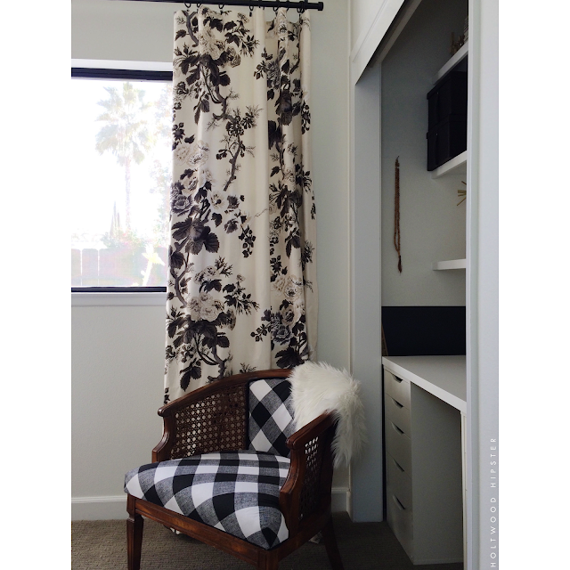
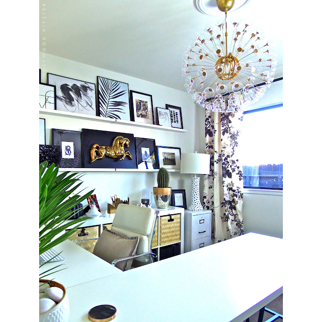
It's the end of the Fall 2015 edition of the One Room Challenge, created and hosted by Linda of Calling it Home (I made it all the way through- whew!). Over these last 6-weeks, I've shared plans, progress and lots of sneak peeks for my guest room turned in-home office space. Today, I'm happy to finally reveal the finished design in its entirety.
What a whirlwind the past few weeks have been. After starting with a relatively blank slate, I got off to a quick start and made lots of progress between Weeks 1 and 2. I painted, Dad came by to help me hang the picture ledges and build out the shelves and I finished the light fixture revamp. I also got through some of the more hands on projects like the lined 'Pyne Hollyhock' drapery panels and buffalo check upholstery on my curbside find in Weeks 3 and 4. But somewhere between Weeks 4 and 6, the project caught up with me and I found myself hung up on the final accessories and styling. As it always does, it all came together over the past weekend - just hours before I was able to get the room photographed for the reveal.
In all honesty, I started working in the space before it was finished and I think that helped me make some of those final decisions I had been agonizing over. It was important to me to make sure that the space was functional as well as pretty. I also wanted to make it a true reflection of my personal style and a place that would make me feel motivated and productive each day while I worked in front of my computer. By moving in early, I was able to make sure I had lighting and a desk set up that was appropriate for the day to day grind - not just a pretty picture.
I utilized a series of bins and files to organize my papers, magazine collection, fabric and project supplies. In styling the room, I also looked to some of my former display pieces like the mini tagines - which I now use (and display) desk side on the back console for paper clips and pins. I also incorporated an up-cycled filing cabinet (found at a local garage sale) to help keep important documents close at hand. I painted out the once dingy cream colored cabinet in white and the sprayed the hardware in a matte black, a scheme that now blends nicely into the other furniture in the room.
My art collection came together pretty fluidly, from both flea market finds - like the mid-century gold horse plaque that was purchased long ago - and newly found treasures courtesy of Etsy. Some of these were even "print your own" images, purchased and downloaded for mere dollars. I used a selection of inexpensive, but well designed frames to showcase my finds and I'm really pleased with the result. To me, the gallery wall in particular and the room in general, was an exercise in designing with my heart and incorporating things that really spoke to me personally. Somehow, all of those individual elements came together into a cohesive design that was representative of my personal style.
As it always does, the One Room Challenge tested my DIY skills in new ways. I tackled the lined drapery panels in perhaps my favorite pattern ever - Schumacher's 'Pyne Hollyhock' - which frankly was a pretty smooth project thanks to an easy to follow blog tutorial. I also reupholstered my first chair, the most difficult part of which was breaking down the old upholstery - a testament to the quality of this old piece.
The closet demo gave way to a better utilized space, now organized to display more of my flea market finds and organize project materials. Truth be told, this area will likely evolve a bit as I fold in more supplies still hanging out in my old office space. But I've left plenty of room to organize and fill with more pretty woven bins to help conceal the chaos.
I kept my now spacious desktop simple and free of clutter. To give you a better idea of scale - that painting is a massive 40 x 40" and at least in photographs, it seems dwarfed on the wall above. Simple IKEA table tops paired with metal trestle style legs gave me more space to spread out my ongoing lists and daily planner each morning and keeps my workspace from feeling too confined.
This room gets the most glorious light throughout the day and has already been a big mood-lifter throughout my workday.
I like to think my home will slowly be completed - one room at a time, every six months through the One Room Challenge. Setting a deadline on the internet is a big motivator to finally tackle a room like this that you know, just seemed to never really come together. It always feels good going into another season with a newly finished room - particularly one like the holiday season when the list of to-dos seems infinite. I can already feel a bit accomplished (and thankful!) walking into my new organized office space.
A big thank you to Linda for hosting and for expanding the challenge to design enthusiasts like myself so that we might take part in all the fun. Be sure to check out reveals by all the bloggers who threw their hat in the ring this round. A big thank you to all who have supported with sweet comments here on the blog and on Instagram. I hope you will continue to follow along. Now that the challenge is over, I have a long list of design adventures still to share - floral projects and events as well as some still unrevealed renovations that have taken place here at the house.
A big thank you to Linda for hosting and for expanding the challenge to design enthusiasts like myself so that we might take part in all the fun. Be sure to check out reveals by all the bloggers who threw their hat in the ring this round. A big thank you to all who have supported with sweet comments here on the blog and on Instagram. I hope you will continue to follow along. Now that the challenge is over, I have a long list of design adventures still to share - floral projects and events as well as some still unrevealed renovations that have taken place here at the house.
The 'before' and weekly progress on this room can be seen here:
Previous ORC reveals:
Guest Bath | Master Bedroom | Masculine Study
SITE MAINTENANCE:
A fresh, new look for Holtwood Hipster is currently in the works! Things may look a little sparse and formatting/fonts might seem a bit jumbled at the moment. But I'm excited to soon share a cleaner, easier to read layout that will help me better connect with all of you! Stay tuned...


